Designing a stage flow component
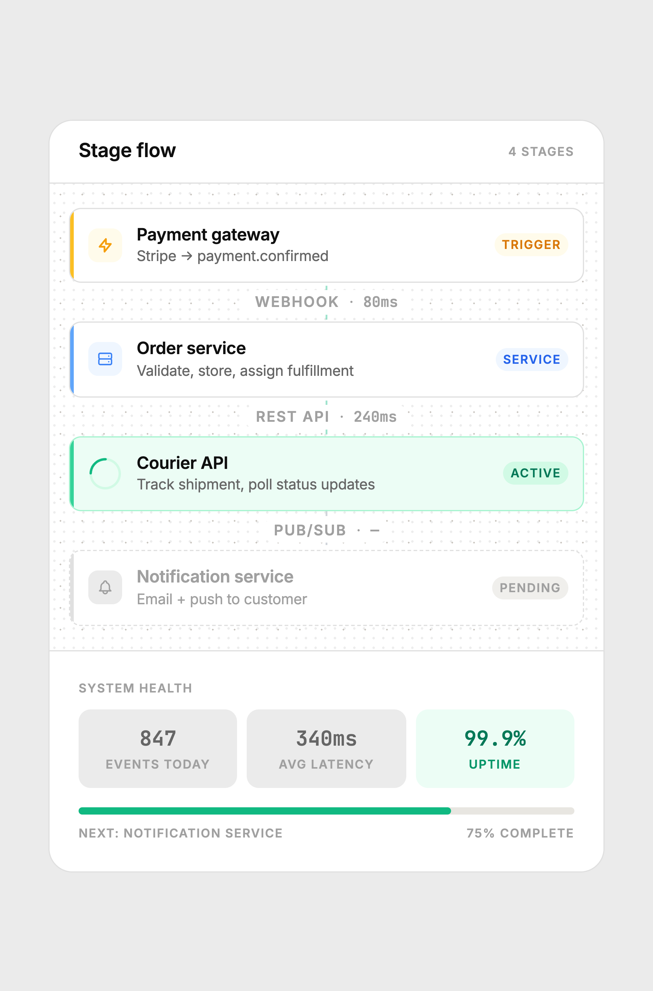
A node-based delivery pipeline card showing how an order moves through distributed services — trigger, processing, active tracking, and pending notification — with animated connectors and live system health stats.
The constraint
Show the internal pipeline of a distributed system — the actual services, protocols, and latencies — inside a single card that non-engineers can read. Most pipeline UIs either look like an engineering diagram (too cold, too dense) or oversimplify to the point of being decorative.
The challenge was finding the middle: technically accurate enough to be useful, visually calm enough to belong in a product interface.
Key decisions
Node model with four role types
Each node has a role: Trigger, Service, or status (Active / Pending). The role is shown as a small badge on the right and communicated through color — amber for trigger, blue for service, green for active, gray for pending. This creates a visual grammar that's consistent without being a legend the user has to learn. After two seconds, the pattern is obvious.
Animated SVG connectors
The connectors between active nodes use an SVG stroke-dashoffset animation to make the dashes appear to flow downward. This signals live data movement without a progress bar or percentage. The pending connector is static and gray — the animation only runs on segments where work is actually happening.
Latency labels on connectors
The connector label shows the protocol (webhook, REST API, pub/sub) and the latency in milliseconds using JetBrains Mono. This makes the connector a data carrier, not just a visual spacer. A pending connector shows a dash instead of a number, communicating "no data yet" without any additional UI.
Left accent bar for role color
Each node has a 3px colored bar on the left edge — the only place the role color appears at full saturation. This is borrowed from Zapier and Linear's node/item patterns. It creates strong vertical scanning: eyes move down the left edge to track the color progression (amber → blue → green → gray) before reading any labels.
Halftone texture on the canvas
The canvas background uses a subtle dot-grid at 18px spacing, similar to engineering graph paper. The outer card carries a finer halftone texture at 7% opacity — applied only in the header and footer, not the canvas, so both textures coexist without competing. The texture adds material quality without visible pattern.
Node states
Amber = trigger. Blue = service. Green with spinner = active. Dashed border + gray = pending. The connector animation only runs between completed and active segments.
Color system
Built with
Takeaway
System architecture does not have to look like a whiteboard diagram to be accurate. Color grammar, consistent node structure, and animated connectors can communicate technical reality at a product design level. The goal is not to hide the complexity — it is to present it in a form that the eye can parse without a legend.