Readability & fun
Extras
Notes
Design Apr 2026Redesigning my portfolio as a personal OS
Why I rebuilt my portfolio from an Apple-inspired single column into a Twitter-style feed — and the design system behind it.
Why I rebuilt my portfolio from an Apple-inspired single column into a Twitter-style feed — and the design system behind it.
The problem
Most portfolio sites are static showcases — built once, forgotten. They don’t reflect how a designer actually thinks or works day to day. The gap between what you ship and how you got there is where the interesting stuff lives.
My old site was clean. Instrument Serif headings, single column, generous whitespace. It looked good, but it was a brochure. Every time I wanted to share a new prototype or write a short thought, I had to build a new page. Nothing about it encouraged regular updates.
I wanted something closer to a living document. A place where prototypes, notes, and project work could coexist in a single stream — updated as often as I think, not as often as I have time to redesign a page.
The direction
I looked at two reference points that solve this well:
Twitter/X — the feed is the product. Everything is a card. Lab prototypes, written notes, and project links all live in the same stream, separated by tabs but unified in structure. The chronological feed means the most recent work is always visible.
Apple HIG — not the skeuomorphic era, but the modern design language. Background separation over borders. Grouped content. Semantic color tokens. Small, quiet typography that lets the content lead.
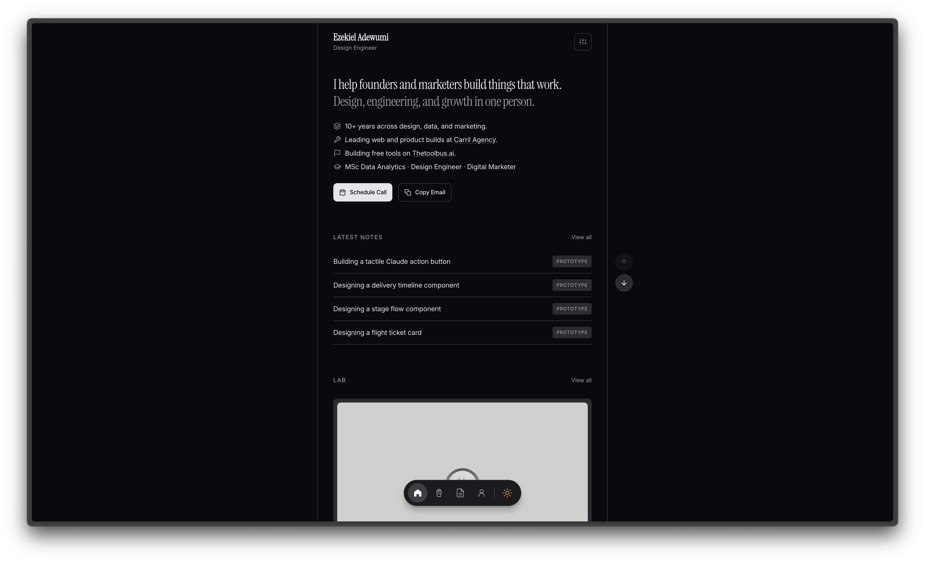
The result is a profile page that feels more like a personal OS than a portfolio. Banner, avatar, bio, tabs, feed.
The design system
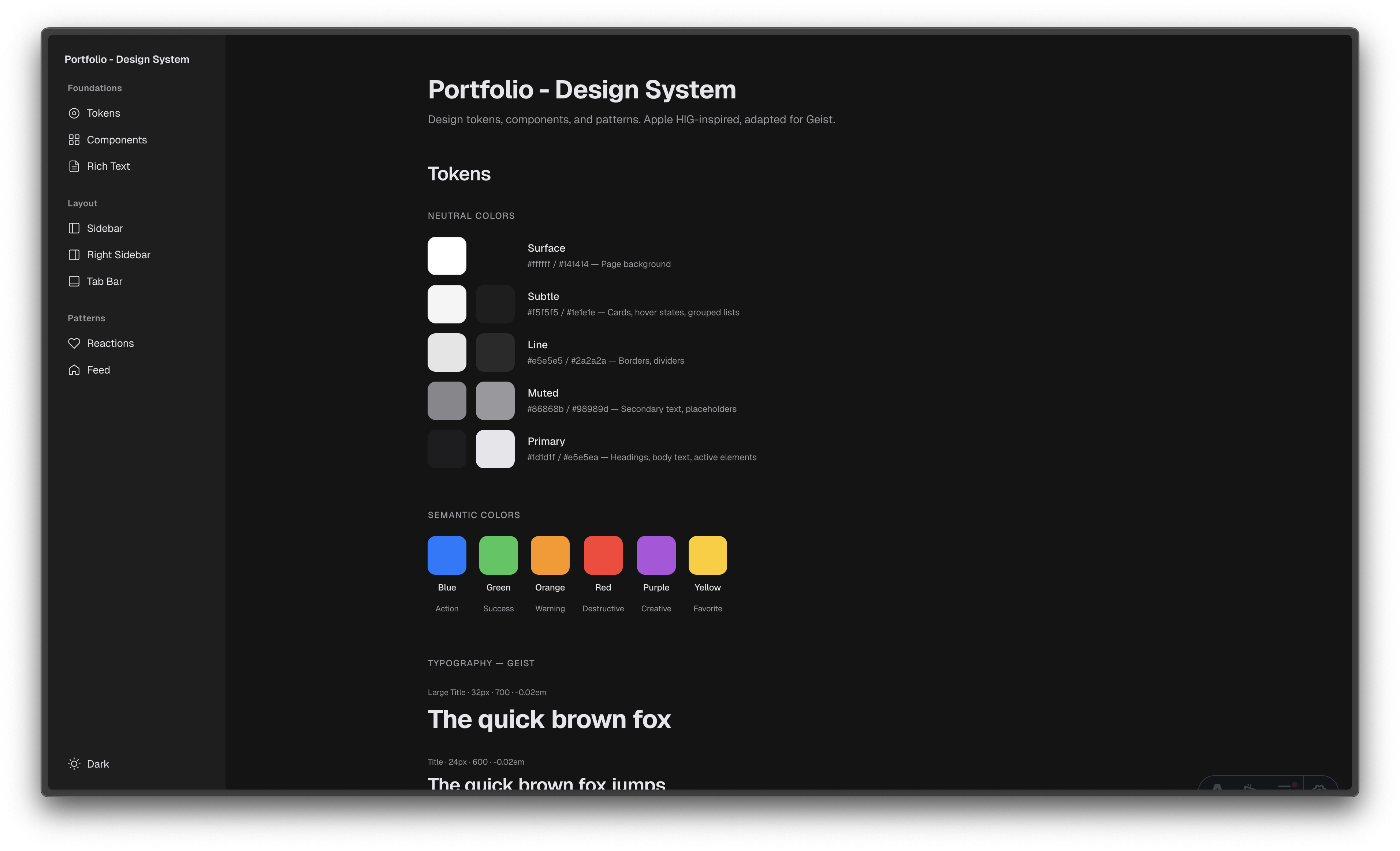
Before touching any production code, I built a design system. Not a Figma library with 200 components — a single page of tokens, components, and patterns that define every decision on the site.
Neutral palette
Five colors, each with a job:
- Surface — the page background (#ffffff / #141414)
- Subtle — cards, grouped content, hover states (#f5f5f5 / #1e1e1e)
- Line — borders, dividers, separators (#e5e5e5 / #2a2a2a)
- Muted — secondary text, timestamps, labels (#86868b / #a1a1a6)
- Primary — headings, body, links (#1d1d1f / #f5f5f7)
No blue for selected states. No accent colors for interactive elements. The palette is monochrome by design — color is reserved for semantic meaning (green for availability, red for errors) and the prototypes themselves.
Typography
Two typefaces. Geist for headings — geometric, tight, modern. Inter for everything else — readable at small sizes, which matters when most of the UI is 12-13px labels and 14px body text.
The heading hierarchy is deliberately compressed. H2 is a 12px uppercase muted label (section divider, not a heading). H3 is 15px semibold (the actual content heading). This inverts the usual hierarchy and lets the content breathe without shouting.
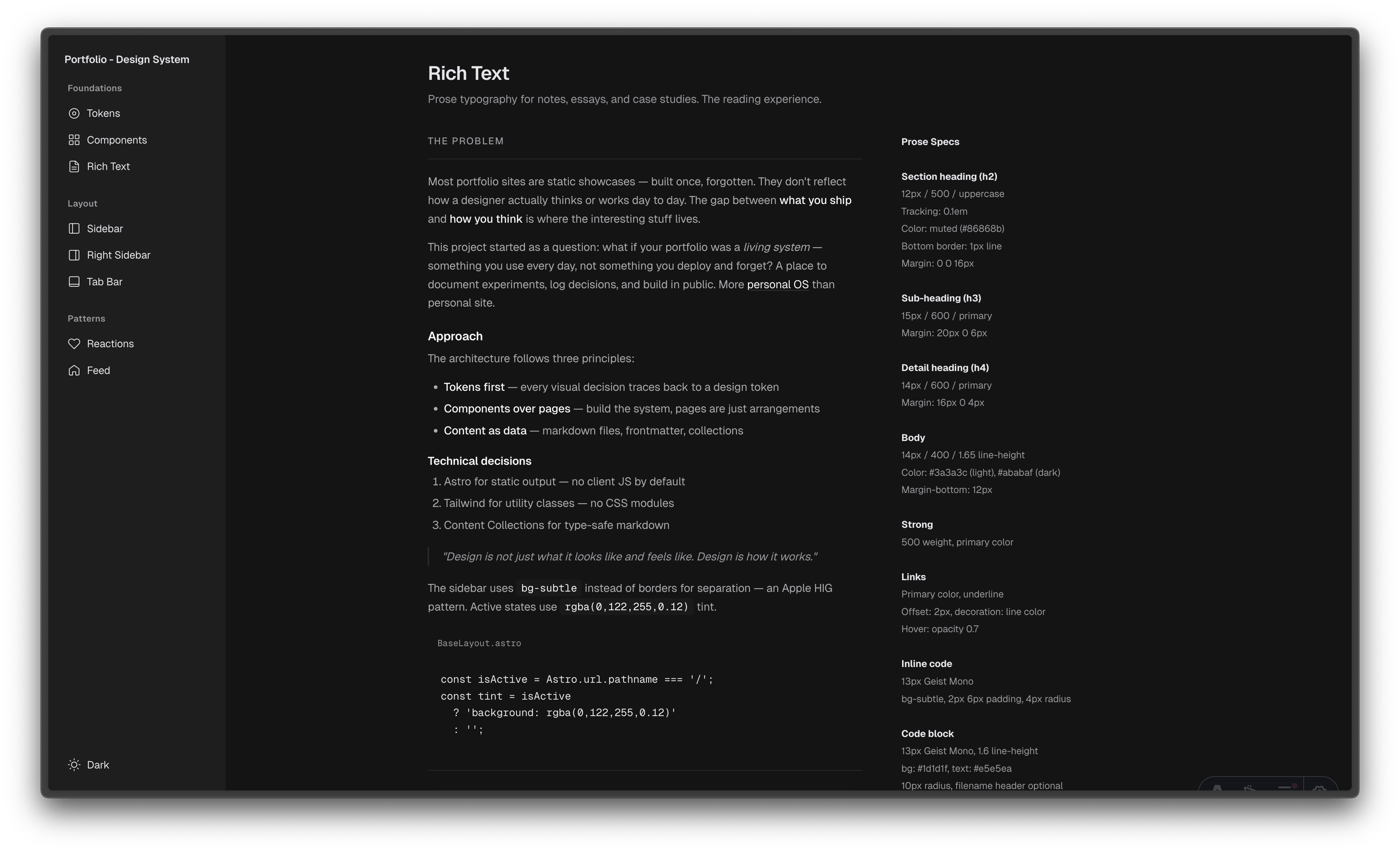
Rich text
Notes needed their own typographic treatment. The prose styling follows the same philosophy — body text at 14px/1.65, strong text at medium weight (not bold), links underlined with the line color (not blue), code blocks on the dark surface.
Key decisions
Feed over pages
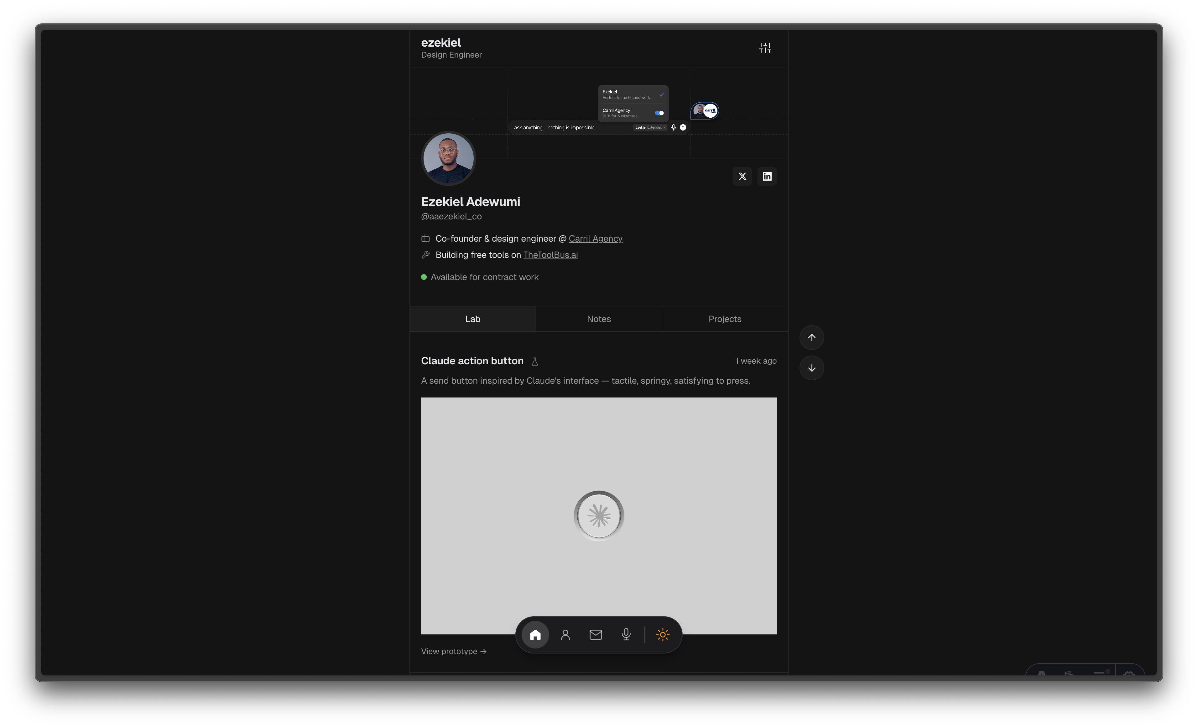
Every piece of content is a card in the feed. Lab prototypes open in a modal — you interact with them without leaving the page. Notes link to their own page for longer reading. Projects link to case studies. The feed is the index, not a separate navigation structure.
Tabs as filters
Lab, Notes, Projects — three tabs that filter the same feed. Not three separate pages. This means the page loads once, and switching tabs is instant. The tab bar sticks on scroll (like Twitter) so navigation is always reachable.
Prototype modals
Interactive prototypes deserve to be interacted with, not screenshotted. Clicking a lab card opens the prototype in a modal with a full viewport. On mobile, it goes full-screen. The prototype runs in an iframe — isolated from the page styles, fully interactive.
Dark mode first
The site is designed dark-mode-first. Light mode exists and works, but the dark palette is the primary experience. This matches how most developers and designers browse, and it makes the prototype thumbnails pop against the surface.
What changed
The old site said “here’s my work.” The new site says “here’s how I think.” The feed format means I can ship a prototype on Monday, write a note about it on Tuesday, and it’s already live — no page building, no layout decisions, just content.
It’s not a portfolio anymore. It’s a personal OS.