Designing a flight ticket card
A matte black boarding pass with a 3D flip reveal, holographic glare sweep, live countdown timer, and tear-line perforation. No frameworks. Just HTML, CSS, and vanilla JavaScript.
The constraint
No React. No build tools. One HTML file that runs anywhere. The challenge was making something that feels premium and interactive using only what the browser gives you natively.
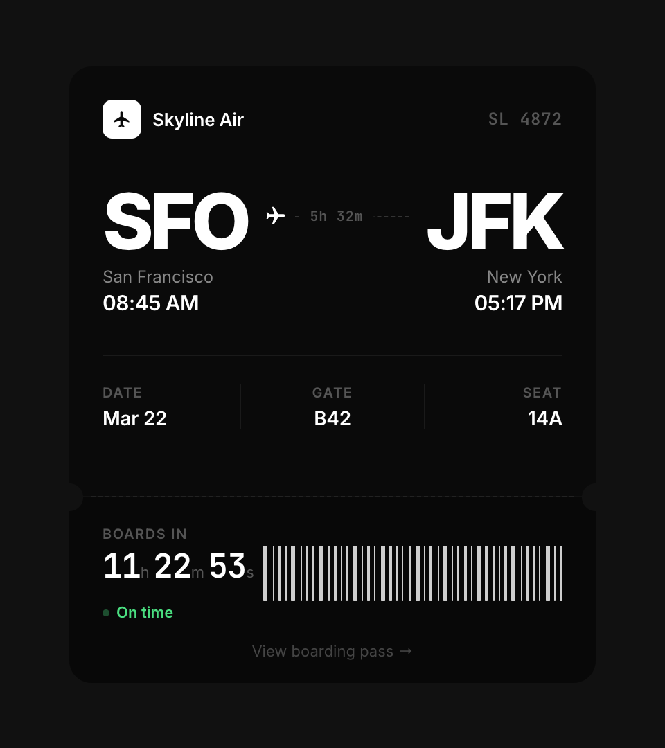
A boarding pass is deceptively simple. Two sections, some text, a barcode. But getting the front and back to feel like two sides of the same physical card requires obsessive attention to height alignment, padding consistency, and visual weight.
Key decisions
Front/back height parity
The card flips in 3D using transform: rotateY(180deg). If the front and back are different heights, the card visibly jumps during the flip. Both sides share the same fixed heights: 310px for the top section, 134px for the stub. Every internal element was measured to ensure the info rows, padding, and content density match within 2-3px.
Holographic glare on a dark surface
The glare is a skewed pseudo-element with a multi-stop gradient: blue, purple, orange, green. It sweeps across the card on a 5-second interval using CSS animation. On a matte black surface, the opacity needs to be higher than on white (28-35% vs 10-15%) because the dark card absorbs more light. The effect feels like tilting a physical card under a light source.
Tear-line perforation
The separation between the main ticket and the stub uses two techniques: a dashed border for the visual cut line, and circular pseudo-elements at each edge that match the background color exactly. This creates the illusion of a physical tear strip. Getting the circles to blend required matching #111 precisely. Any mismatch and the circles become visible artifacts instead of invisible cutouts.
Live countdown, not static time
The stub shows a real-time countdown to departure. It ticks every second and reformats the display based on remaining time: hours/minutes/seconds when far out, just minutes/seconds under an hour. The status shifts from "On time" (green) to "Now boarding" (amber) under 30 minutes, making the card feel alive and time-aware.
Two font families, three weights
Inter at 400 and 600 for all readable text. JetBrains Mono at 600 for data that needs to feel machine-generated: the flight number, countdown timer, and confirmation code. The airport codes (SFO, JFK) use Inter at 800 and 56px. Weight creates hierarchy. The mono font creates category distinction.
Color system
Built with
Takeaway
A flip card is a solved problem. Making it feel like a real object is not. The work is in the invisible details: matching heights to the pixel, tuning glare opacity for a dark surface, blending cutout circles with the background. No framework solves these problems. Only your eyes do.