Designing a delivery timeline component
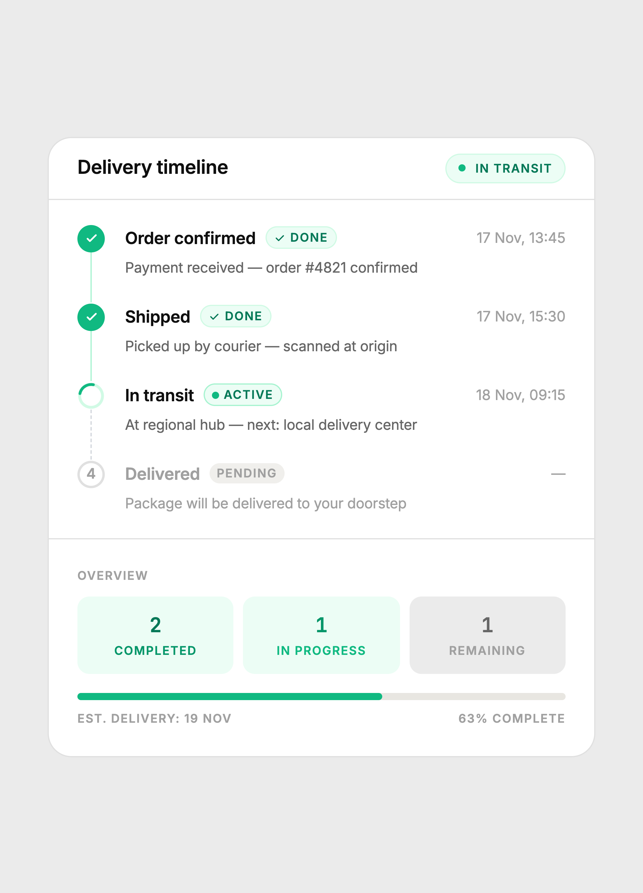
A four-step order tracking card with distinct done, active, and pending states. No boxes, no noise — just a clean vertical timeline with inline descriptions, a live spinner, and an overview stat grid.
The constraint
Show the full order journey in a single card without overwhelming the customer. Most delivery UIs either cram too much metadata into each step or go so minimal that the active state gets lost.
The goal was one card that answers three questions at a glance: what happened, what's happening now, and what's next — without the user having to read anything carefully.
Key decisions
Three distinct step states
Done steps use a solid green circle with a checkmark. The active step uses a spinning arc — a real CSS animation, not a static icon — so the eye immediately knows something is happening. Pending steps use a hollow circle with a number. No color, no weight, no competition. The active step is always the most visually dominant element on the card.
Connector line state
The vertical connector between steps changes state too. Completed segments use a solid green line. The segment below the active step uses a dashed gray line — the dotted pattern signals incompleteness without needing a label. This mirrors how progress bars work visually, applied vertically.
Inline descriptions, no detail boxes
Earlier versions put step metadata in bordered boxes below each step title. It looked structured but felt heavy and medical. Switching to inline p tags with muted color removed all the visual weight while keeping the same information density. The card got shorter and felt calmer.
Header badge communicates system state
The card header carries an "In transit" badge with a live green dot. This means a user can glance at the card header alone and know the current status without reading any of the steps. The badge and the active step in the timeline always match, creating redundant clarity.
Overview stat grid
The footer stat grid (completed / in progress / remaining) mirrors the step data but in numeric form. Both representations live in the same card, targeting different reading modes: scanners read the numbers, readers follow the timeline. The progress bar below the stats gives spatial progress, which neither the numbers nor the steps provide on their own.
Step states
Green solid = done. Spinning arc = active. Hollow numbered circle = pending. The connector line changes from solid to dashed at the active step.
Color system
Built with
Takeaway
A timeline is not a list of events. It is a communication of momentum. Every visual choice — the spinner vs the checkmark, the solid line vs the dashed one, the inline text vs the box — either reinforces or undermines that momentum. Remove whatever slows the eye down. Keep whatever tells the story faster.