Readability & fun
Extras
Notes
Component Mar 2026Business Hours Widget
An animated business hours widget for React. Shows live open/closed status, an analog clock synced to the business timezone, and an expandable weekly schedule with Framer Motion animations.
Installation
Install the component and its peer dependency.
// Terminal
npm install business-hours-widget framer-motion
The widget uses the Inter typeface. Load it in your app for the intended design. If Inter is not available, the component falls back to the system font stack.
// index.html
<link href="https://fonts.googleapis.com/css2?family=Inter:wght@400;500;600&display=swap" rel="stylesheet">
Usage
Import the component and pass your business details. It can be placed anywhere in your React app. The card uses a frosted glass effect — it looks best on a light gray background (#f3f3f3).
// App.tsx
import { BusinessHours } from 'business-hours-widget'

function App() {
  return (
    <BusinessHours
      name="Carril Agency"
      timezone="America/New_York"
      schedule={{
        monday:    { open: "09:00", close: "18:00" },
        tuesday:   { open: "09:00", close: "18:00" },
        wednesday: { open: "09:00", close: "18:00" },
        thursday:  { open: "09:00", close: "18:00" },
        friday:    { open: "09:00", close: "17:00" },
        saturday:  { open: "10:00", close: "14:00" },
        sunday:    { closed: true },
      }}
    />
  )
}
The widget automatically determines the current status based on the timezone you provide. The analog clock updates every frame. The status recalculates every second.
States
The widget transitions between states based on the current time in the business timezone.
// open.tsx
// Status badge turns green and pulses.
// Subtext shows "Until 6:00 PM".
// Progress bar fills as the day progresses.
monday: { open: "09:00", close: "18:00" }
// closing-soon.tsx
// Within 60 minutes of closing, status shifts to amber.
// Subtext shows remaining time: "42 minutes remaining".
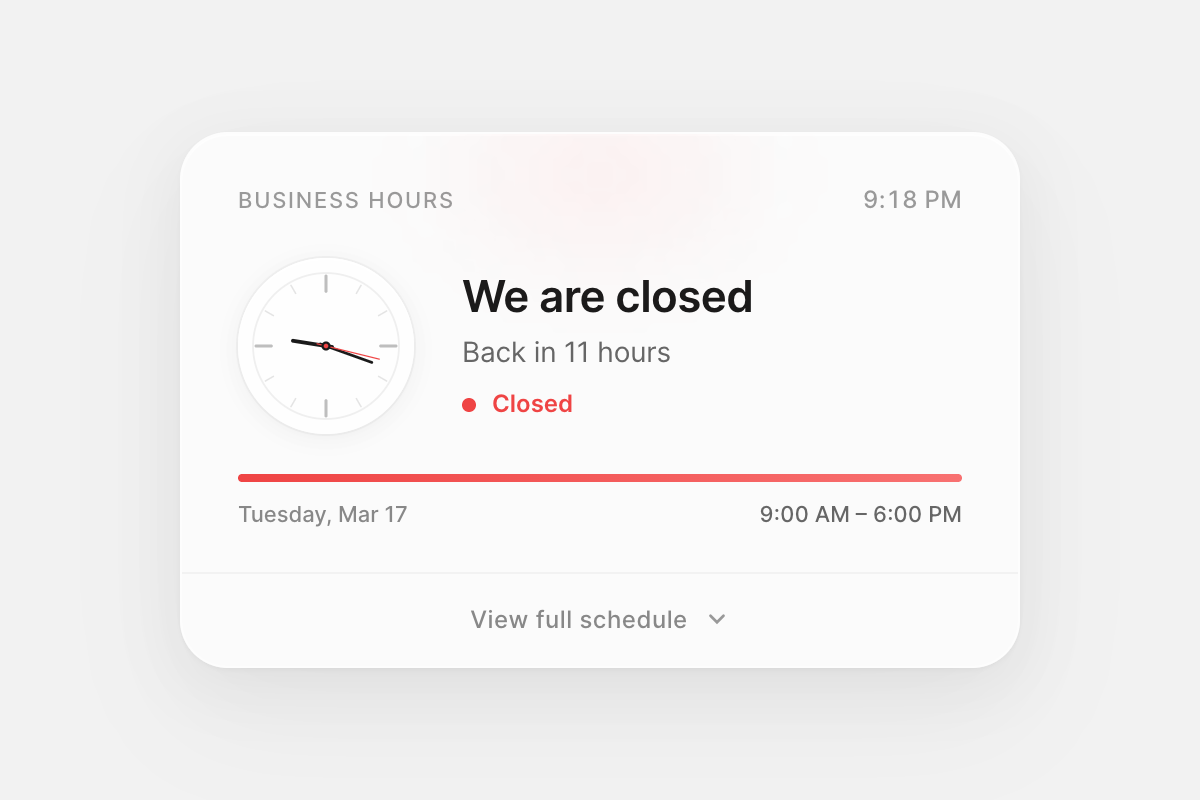
friday: { open: "09:00", close: "17:00" }// closed.tsx
// Status badge turns red. No pulse.
// Subtext shows when the business reopens: "Back in 13 hours".
sunday: { closed: true }API
Props
| Prop | Type | Required | Description |
|---|---|---|---|
name | string | Yes | Label displayed in the widget header |
timezone | string | Yes | IANA timezone identifier for the business location |
schedule | BusinessHoursSchedule | Yes | Weekly schedule object, keyed by lowercase day name |
Schedule
The schedule prop accepts an object with all seven days of the week. Each day uses a DaySchedule object.
| Field | Type | Default | Description |
|---|---|---|---|
open | string | — | Opening time in 24-hour format, e.g. "09:00" |
close | string | — | Closing time in 24-hour format, e.g. "18:00" |
closed | boolean | false | Set to true for days the business is closed |
When closed is true, the open and close fields are ignored. When closed is omitted or false, both open and close are required.
// schedule.ts
const schedule = {
  monday:    { open: "09:00", close: "18:00" },
  tuesday:   { open: "09:00", close: "18:00" },
  wednesday: { open: "09:00", close: "18:00" },
  thursday:  { open: "09:00", close: "18:00" },
  friday:    { open: "09:00", close: "17:00" },
  saturday:  { open: "10:00", close: "14:00" },
  sunday:    { closed: true },
}
Timezone
Pass any valid IANA timezone identifier. The widget uses the browser-native Intl.DateTimeFormat API to resolve time in the business’s local timezone — not the visitor’s browser timezone.
// timezone-examples.ts
timezone="America/New_York"    // UTC-5 / UTC-4
timezone="Europe/London"       // UTC+0 / UTC+1
timezone="Asia/Lagos"          // UTC+1
timezone="Asia/Tokyo"          // UTC+9
timezone="Australia/Sydney"    // UTC+10 / UTC+11
Styling
The widget uses a frosted glass card design (420px width, 24px border radius, backdrop blur) with inline React styles. No external CSS is required.
Status colors
| State | Hex | Glow | Use |
|---|---|---|---|
| Open | #22c55e | rgba(34,197,94,0.1) | Dot, progress bar, badge text |
| Closing soon | #f59e0b | rgba(245,158,11,0.12) | Amber shift within 60 min of close |
| Closed | #ef4444 | rgba(239,68,68,0.08) | Dot, progress bar, badge text |
The clock second hand matches the current status color. An ambient radial gradient glow at the top of the card also shifts color with status. These values are intentional and not currently exposed as props.
Customization
To adjust the visual design, fork the component source and modify the style objects in BusinessHours.tsx directly. The component uses zero CSS classes — all styles are inline, making them straightforward to override.
Notes
Peer dependencies — requires React 18+ and Framer Motion 10+. Framer Motion powers the progress bar animation, status text transitions, dot pulse, and schedule panel expand/collapse. Timezone calculations use the native Intl.DateTimeFormat API. The analog clock is pure SVG rendered via requestAnimationFrame.
Closing time is exclusive — { open: "09:00", close: "17:00" } means the status switches to “Closed” at exactly 17:00:00. If you want “Open” to include 17:00, set close to "17:01".
Closing soon — when the current time is within 60 minutes of the closing time, the widget transitions to an amber “Closing soon” state with a countdown subtext.
Back in — when closed, the widget scans the next 7 days to find the next opening time and displays “Back in X hours” or “Back in X days Y hours” as appropriate.
Accessibility — the clock SVG is marked aria-hidden since it is decorative. The status badge and text convey the same information to screen readers.
TypeScript — full type definitions are included. Import BusinessHoursProps, BusinessHoursSchedule, and DaySchedule from the package for use in your own types.
// types.ts
import type { BusinessHoursProps, DaySchedule } from 'business-hours-widget'